
It goes without saying that you want your used car dealership to be as accessible as possible. You don’t want buyers to have any trouble finding the place. You don’t want any barriers between the parking lot and the building. You want to have clear signage showing buyers exactly where to go and how to find what they want. Simply put, you want them to have the best experience possible while they’re on your lot.
The same principles hold true with your dealer website. If you want the site to be a lead generator or a sales converter, it’s critical that you provide your users with a smooth, seamless experience. This concept—of making your website as accessible and as functional as possible—is well-known to website designers and marketers alike, who simply refer to it as user experience, or UX.
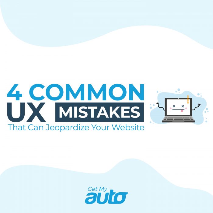
So, how’s the UX on your dealer website? You may assume it’s pretty good but be careful. There are some common errors that can sink an otherwise solid website performance. Here are four of the usual culprits; make sure your dealer website isn’t falling into any of these traps!
4 Common UX Errors
- Not having a clear path for navigation. Some of your website visitors may arrive at the site hoping for general information about used cars, others, your financing deprtment. Still others may have a very specific make and model they’d like to search for. Hopefully, your site has a clear and simple navigation structure, making it easy for visitors to find whatever information they’re after.
- Forgetting that most users won’t read—they’ll just skim. Frankly, most Internet users don’t spend a lot of time truly reading. They just want to skim your content to isolate the necessary information. Your site should facilitate easy skimming, and that means having plenty of white space, short paragraphs, bulleted lists wherever applicable, and section subheadings.
- Forcing your visitors to wait. We clang this bell often, but it’s really important that your website load expediently. Most users aren’t going to sit around while your website populates with content; if it takes more than two or three seconds, they’ll be gone. Double check that your site loads properly on all browser and device types.
- Not having a clear call to action. Your users should be able to very quickly look at any page of your website and see where they can click to call, email, or set an appointment with your dealership. Make contact information and CTAs plainly evident.
Are You Giving Your Website Users a Smooth Experience?
For used car dealerships, ensuring a smooth website experience is vital. Without it, you may find that your online leads and conversions really taper off. Fortunately, all of these common UX issues can easily be remedied through smart, intentional website design.
One simple way to achieve that is by using the SaaS website platform from Get My Auto, which is designed with dealerships in mind. To learn more, reach out to Get My Auto at any time!